Geometry and lighting work

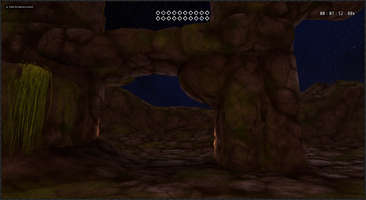
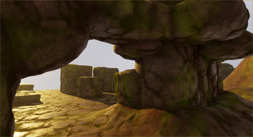
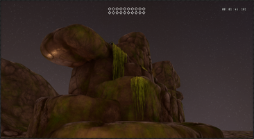
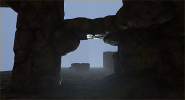
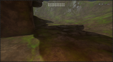
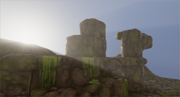
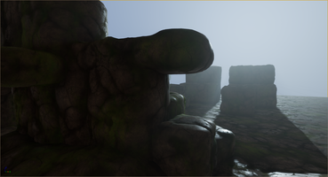
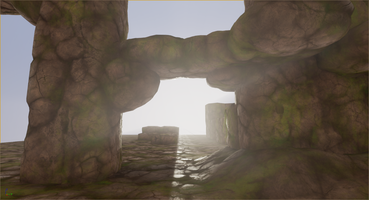
I've been struggling for a while with the look and feel of Freepath. So far, I've just used a relatively simple polished tile sort of material for all of the levels. I think that material will show up in the final product, but I definitely wanted to add more visual interest and variation.
Freepath is, first and foremost, a game about exploring, so it's important that it is appealing to look at and that the environments are part of the reward for playing. But it is also a game about freedom of movement, platforming, and parkour, which means the environments need to be relatively easy to interpret in terms of distances and shapes.
Right now I'm a one-person team too, so I need the pieces that make up the environment to be relatively easy to build and simple to work with.
I thought a lot about using a simple set of gray-box style shapes (more or less what the prototypes are built with) and varying the colors and surface features a bit but getting that to look interesting is actually pretty tricky. The shapes and surfaces don't offer much on their own so lighting and little details like roughness and ambient occlusion wind up being very noticeable and very important in ways that can be pretty unforgiving. The plan for Freepath also includes some natural environments, which don't lend themselves to super flat shapes very well.
A few years ago Hourences (the designer / developer for The Solus Project and an Unreal Engine tutor / evangelist) released some videos with a really interesting technique for generating rock meshes based on height maps (Hourences' videos are here: detailed rock generation video / more general development video featuring the technique). I tried this approach out directly in Blender but never quite got results I was happy with for Freepath. It definitely got me thinking in a good direction though.
Today, for the first time, I feel like I'm close to the look and feel and style I want. I wound up combining simple beveled and rounded cube meshes with real-time tessellation and displacement based on a height map and world-aligned textures. I think the simple underlying shapes still come through and make it relatively easy to understand where flat surfaces like walls and floors are (except for a couple of spots that are still a little too "puffy" looking), and the combination of cubes that more or less align on a grid and world aligned textures (including the height map) make the pieces very forgiving to work with.
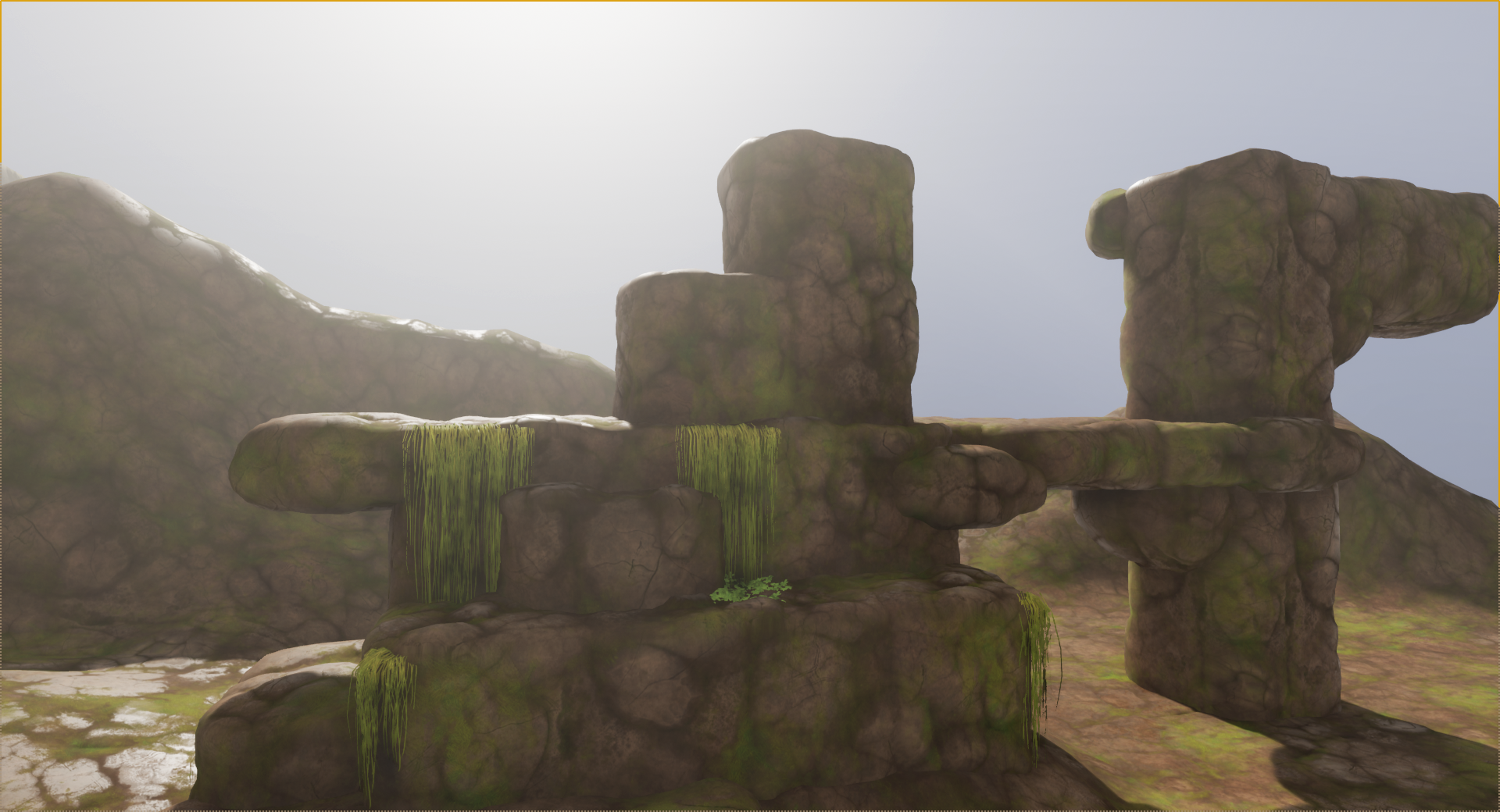
I did another round of tweaking to the lighting to go along with testing out the new meshes and materials.
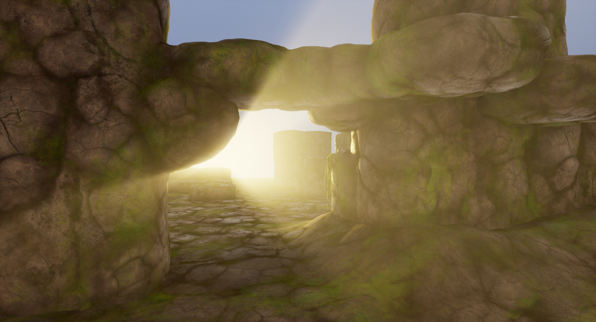
Unreal Engine 4 has pretty fantastic lighting features out of the box but it can still take a surprising amount of fiddling to get things to look just right. The sky still needs a lot of work to look good throughout the day / night cycle, but the sun and moon lights along with the environment and post processing settings are starting to hit the notes I want; like this nice burst of light around sunset:
Get Freepath Prototype
Freepath Prototype
First person exploration with parkour elements
| Status | Prototype |
| Author | Spinfoam Games |
| Genre | Adventure, Platformer |
| Tags | First-Person, Parkour |
More posts
- A Quick Return to FreepathMar 24, 2020
- Second level added!Jul 16, 2019
- 2019-06-22 UpdateJun 23, 2019
Leave a comment
Log in with itch.io to leave a comment.