Gearing up for a major UI update


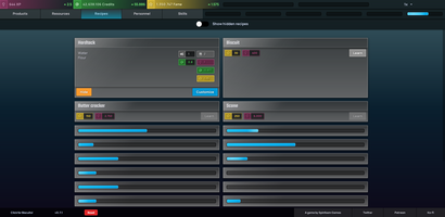
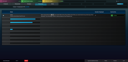
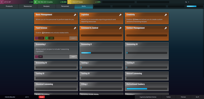
After quite a bit of tweaking and re-working the new UI for Click for Biscuits is nearly ready to go.
I didn't hate the previous UI (especially once the dark theme was added), but it was a bit ... antiseptic.
Click for Biscuits is very much a game about managing resources, balancing costs and income, and generally watching numbers go up; so the UI will probably always be a bit dense with information.
I wanted to get a bit more of a sense of something like a sci-fi / space-based 4X game though, and that's been the inspiration for this UI refresh.
Under the hood this UI is entirely purpose-built for Click for Biscuits too, so there are fewer extra bits and cruft around the edges which makes it quite a bit easier to work with from a development standpoint.
Get Click for Biscuits
Click for Biscuits
Incremental style food management game
| Status | In development |
| Author | Spinfoam Games |
| Genre | Simulation, Strategy |
| Tags | Incremental, Management, Text based |
| Languages | English |
More posts
- v0.15.0 ReleasedJun 29, 2020
- v0.14.0 ReleasedJun 19, 2020
- Downloadable Biscuits and a subreddit!Jun 05, 2020
- Boilerplate Code ReleasedJun 03, 2020
- v0.12.0May 29, 2020
- v0.10.0May 15, 2020
- v0.5.0Apr 03, 2020
- v0.4.1Mar 31, 2020
- v0.4.0Mar 27, 2020
Leave a comment
Log in with itch.io to leave a comment.